E-learning is an interesting industry, but compared to web and app design, it feels a little behind. There are some interesting tools and people doing some innovative work but much of it is out-of-date compared to other forms of digital design.
There are a bunch of sub genres of e-learning, but the module we tested is intended for professional development. It would be something you buy (or an employer buys) to help expand a skill-set and knowledge base. Our audience is speech-language pathologists and other professionals who work with young children in schools and pre-schools.
What we did
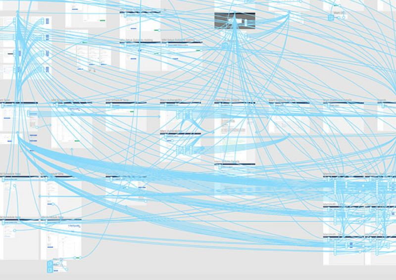
After several months of development and design we had one instalment (module), of a much larger tutorial, finalized. More are in the works but we were ready to test this first module. We built and published the module using software called Articulate Storyline. It’s a powerpoint-like tool created specifically for e-learning. It is slide based and you move through the slides, like a powerpoint. Unlike a powerpoint it has an array of interactive elements to create quizzes and other activities. It’s robust enough to create something interesting and engaging but not quite to the level of something bespoke.
We had arranged for 8-10 real users to be in the office at the same time. 5 would be observed one-on-one and the remaining would be observed in a group setting. We did this because we wanted to observe any shift in dynamic when a group completed the module together, rather than an individual. A group was a possible use case for the module, so it was important to note differences in how a group interacted with it compared to an individual.
We also tested on a few different devices including laptops, desktops, and tablets. Most of the observers were not from a digital background and had never participated in any sort of usability or user experience testing. This was a positive for us since we had to do so many tests concurrently and wanted a variety of viewpoints and avoid some bias.
What happened
The lead up to the sessions went well. The employees selected to be observers were open to the direction the design team had given them. Once the particpants had enjoyed some free pizza, 5 observers introduced themselves and took 1 participant each into a private office. The remaining participants stayed behind and tested as a group. We tried to find quiet spaces without too many distractions.
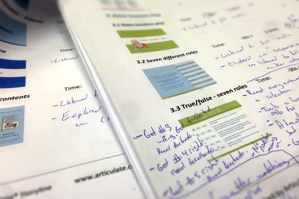
The observers first goal was to make the user comfortable, and explain that we wanted them to think out loud and verbalize as much as possible. We had created note sheets in advance for each observer. The sheets contained thumbnails of every slide, key information like time ranges that an observer could quickly circle, and space to write detailed notes. The observer spent the next 40-60min watching their participant and encouraging them to keep thinking out loud.
Communication turned out to be the most difficult part of the testing. Because the tutorial contained a lot of audio narration it deterred the user from speaking out loud in fear of talking over some of the narration. Observers tried to encourage verbalization when there were opportunities in the tutorial, like a break in the audio.
There were also 3 points in the tutorial when an observer would stop for a minute and pose a question. We asked about the section they had just completed and were checking for retention of information and perception up until that point. We made sure to ask open ended questions to get more out of the participant than a simple yes or no answer.
What we learned
After the sessions were over, the observers all met to debrief and share experiences. Notes and observations were shared, some expected, some not. We categorized findings into 2 categories, major issue, and minor issue. A major issue usually affects the entire tutorial and will need a fair amount of work and further testing to resolve. A minor issue is less work and usually has to do with one specific slide or element.
As you might imagine there are more minor issues than major, in fact, the major issues were boiled down to 2 points. The first major issue was pace. Our sessions were going over what we had estimated for length by quite a bit. Because of the nature of the product and our audience, we were not concerned if length was a little longer, what was a concern is the balance of audio, video, and interactivity. The sessions made it clear that most slides were too front loaded with audio, which interrupted the experience and pacing. We also had too much audio in general, where stretches of a minute or more were not uncommon. All this audio along with back to back to back video examples in some sections caused major pace issues, and visible fatigue in some participants.
The second major issue was interactivity. When designing and building a complex e-learning tool you can spend a lot of time developing and testing interactive elements. Getting every interaction just right. When we tested, we noticed that interactivity made up only a small part of the users experience. All those hours of development ends up in a slide that takes a user 20 or 30 seconds to complete.
It was clear that interactivity had to be present throughout more of the tutorial. This would keep the user engaged and also help deal with some of the pacing.
Conclusion
There is no substitute for real user testing. The amount of data points you can gather is amazing. It is also important to keep the cycle going, iterate on what was learned, and re-test.